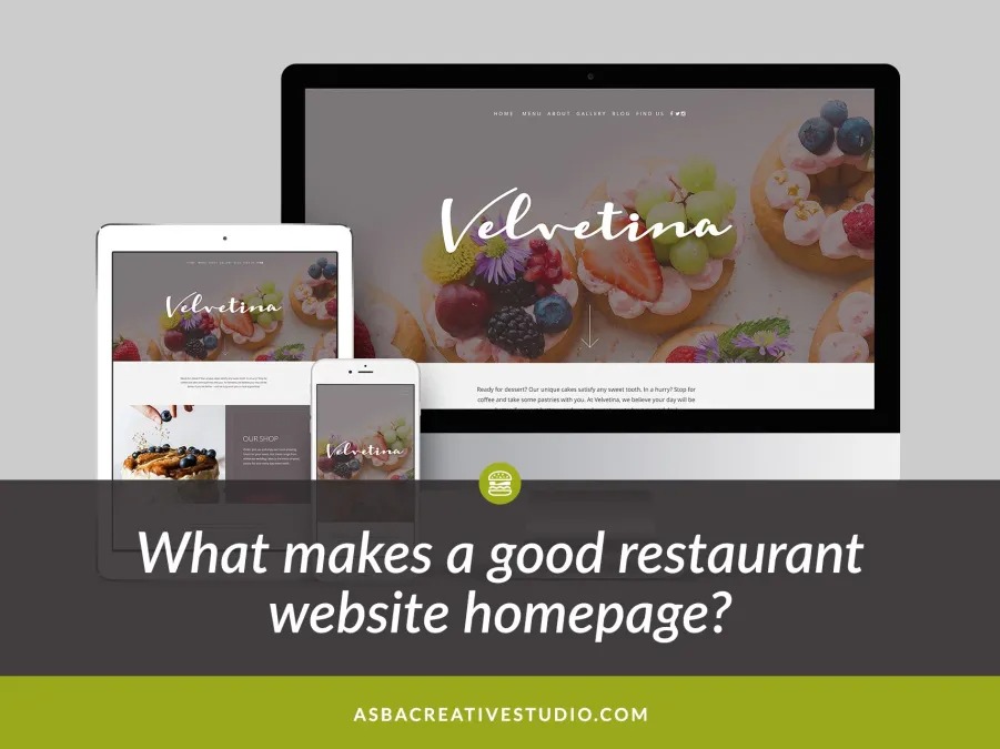
Your website’s homepage is the first impression customers get when they visit your website. Whether we like it or not, a majority of people base their assumptions about someone on the first thing they see so a large part of your website’s success depends on the success of your homepage.
Below, I have listed a few points that can help you achieve homepage success to help improve how long your visitors stay on your website.
You homepage should speak to your target audience
Use language and design style that resonates with your target audience. If you serve customers right by the beach, do not use a tone of voice that will work well for a corporate environment.
Your homepage should be inviting and eye catching
It must be well-designed and eye-catching to keep your customers wanting more. It must lead your customers down the path you intend for them to go by means of navigation, page links, white space and even imagery.
Your homepage should provide details on how to connect with you
It should have your contact information eg. phone number, address, and social media handle to make you accessible to your customers.
Your website homepage should display well on all device sizes
It should look great and be legible on all devices so no matter how they find you, you give off a good first impression.
Your homepage should provide a description of your restaurant and why they should visit you
Make sure it describes who you are as a restaurant. It should be clear for customers to know right away the type of food you serve, who you are and what you are about. Don’t leave it to chance because you want them to know they are in the right place so they don’t think of leaving your website.
Your homepage should contain links to other areas of your website
It should not be static. It should have call-to-actions (CTAs) that take the user to different areas of your website. Giving the user these doorways engage them and keep them on your website longer for a possible conversion from user to customer.
Your homepage should have at least one photo of your food
Lastly, make sure to flaunt your food right on your homepage with great photos of your food. Customers like to see pictures of food and it definitely moves people to want to eat at your restaurant.
So how do you feel about your homepage now? Let me know if you have any questions or take advantage of my free homepage review by signing up above.


